Design System/Digital Styleguide
Design System, Visual Design
Designing, establishing, and documenting Flight Centre Canada's very 1st Digital Brand Guidelines
Create a design guideline for establishing consistent digital designs language across the Flight Centre Digital platforms for the Canadian branch.
Flight Centre is Canada’s largest brick and mortar travel retailer, including retail stores, online bookings and 24/7 phone lines. The brand is HQ in Australia and established around the globe.
Client
Flight Centre Canada
www.flightcentre.ca
Collaborations
Internal Creative Team and Digital Team
My Role
Design System lead, Survey & Inquiry, Documentation, Visual design, Process/Pipelines establishing
Time
Feb - Jun 2019
Link
Flight Centre Canada - Digital Styleguide
Desktop only*
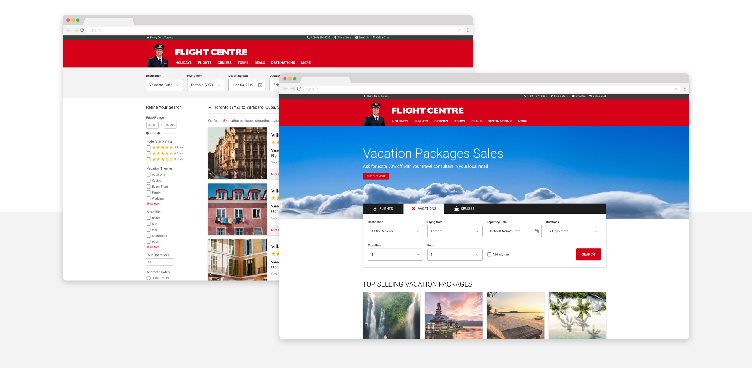
The travel search form built using the Flight Centre Digital Styleguide's Sketch Component library.
The Challenges
Design at Scale & Consistency
As the Flight Centre Canada site grew rapidly, the inconsistency between legacy and current designs are out of sync. The existing pipelines are not able to handle the linear design request process.
The goal is to create a guide that the teams could build upon and that can be scaled at ease. The Stylguide should direct designers, developers, and marketers creating a single design language.
The Documentation
As the UI designer, I built out the Flight Centre Canada Digital Styleguide from the ground up, trying to evolve the Canadian branch's digital platforms.
Flight Centre Canada - Digital Styleguide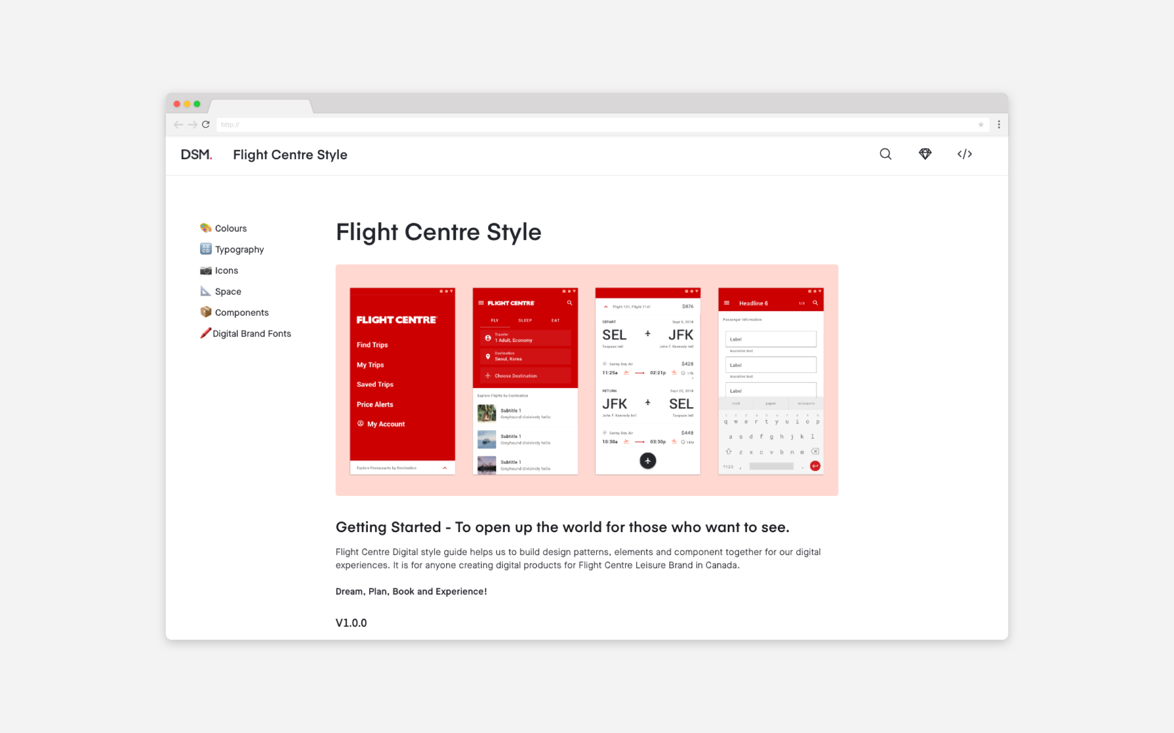
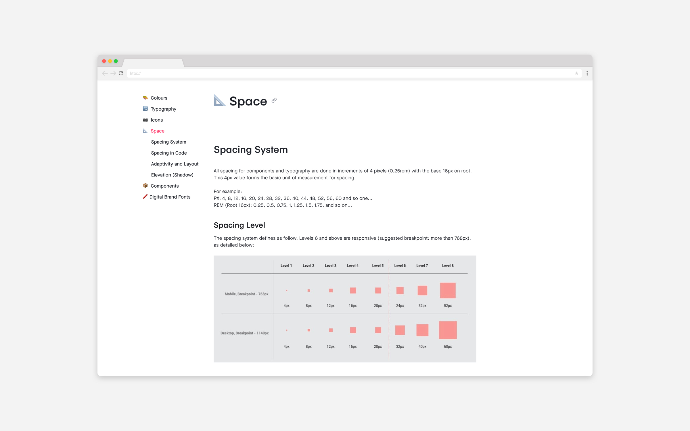
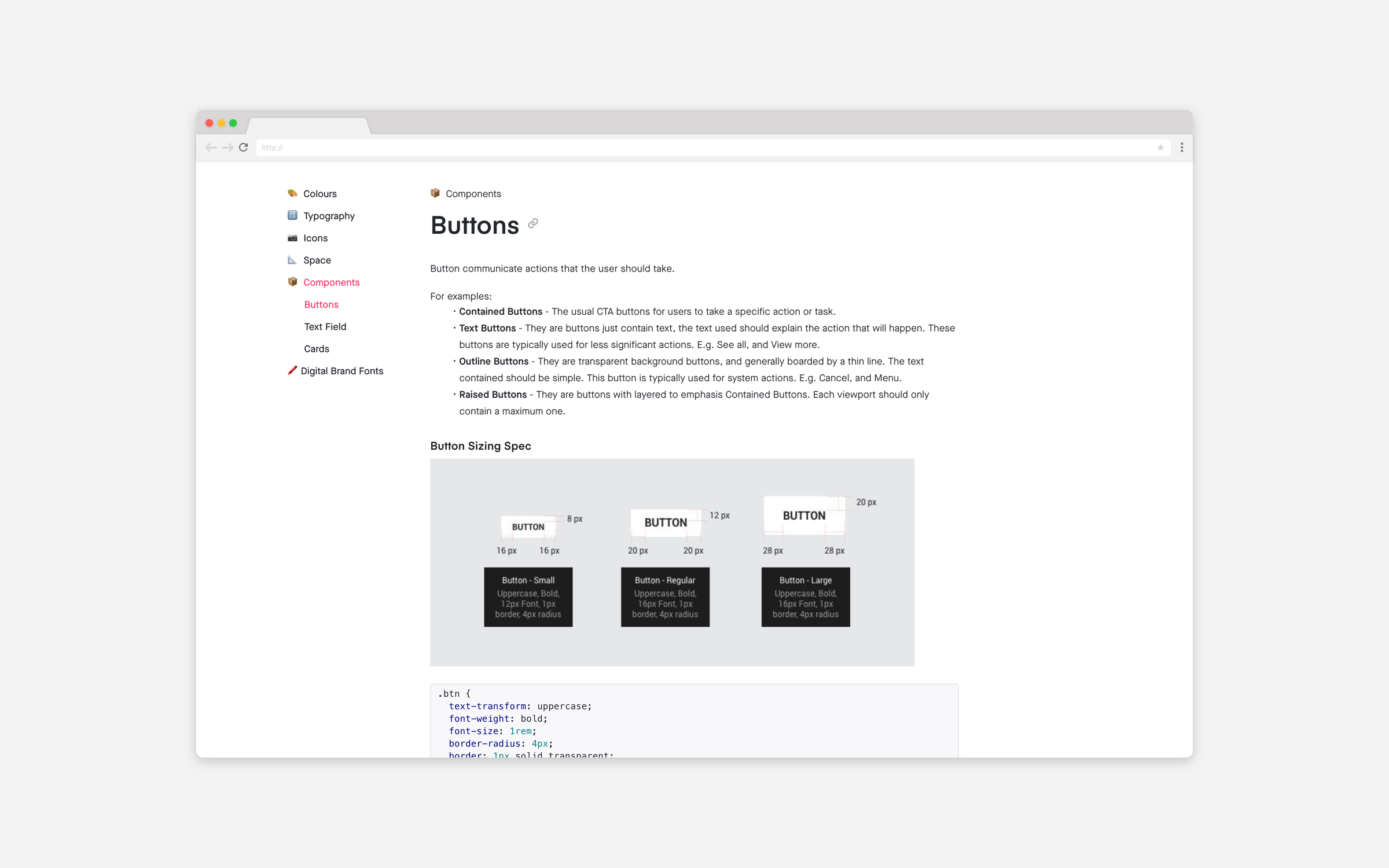
The Style System
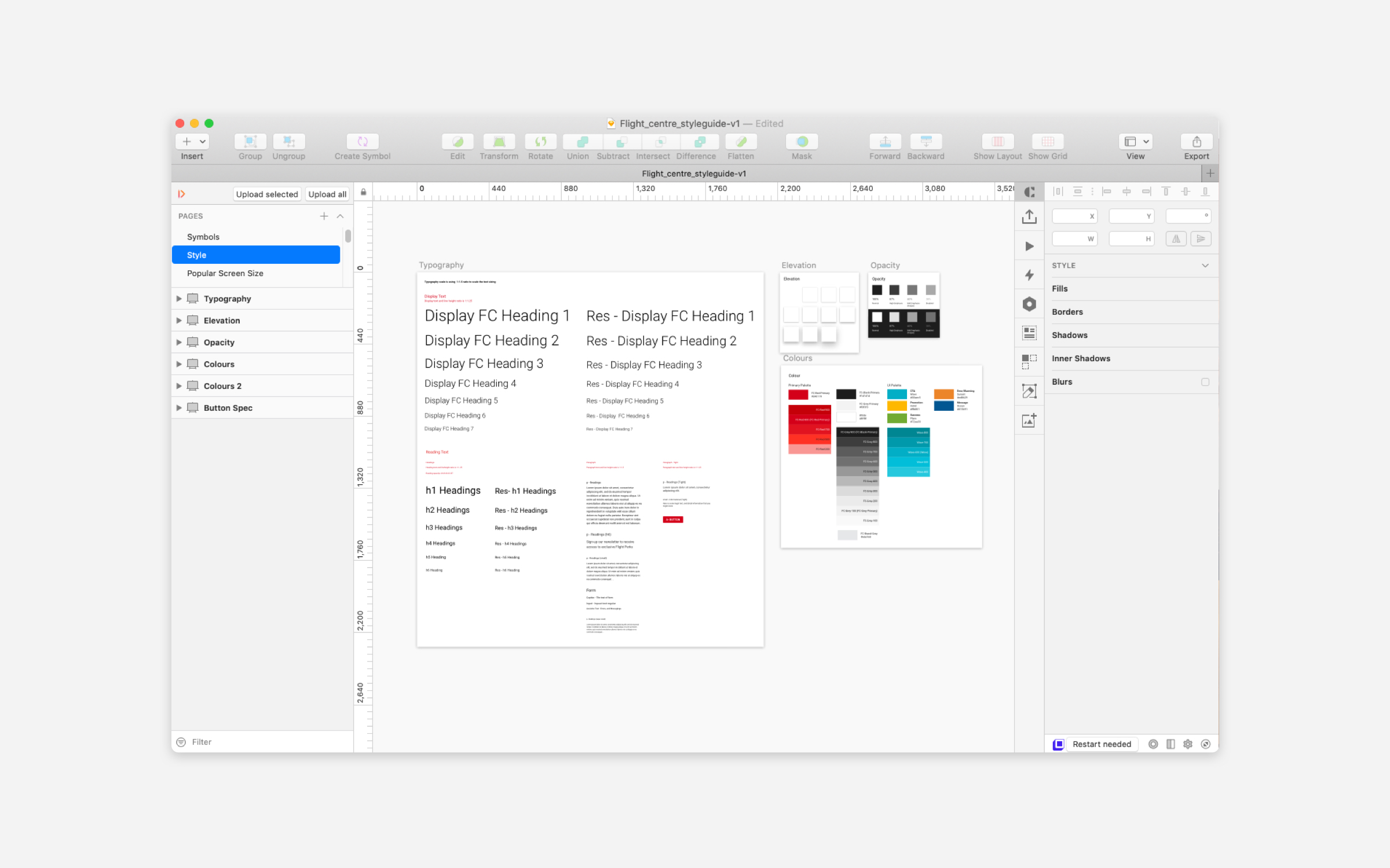
The Flight Centre Canada Digital Style was made into as a library in Sketch, and linked to a sharable document via inVision Design System Manager plugin.
The library is reusable and updates at ease, designed using atomic/component design approaches, making UX/Product Design delivery more realistic and faster.
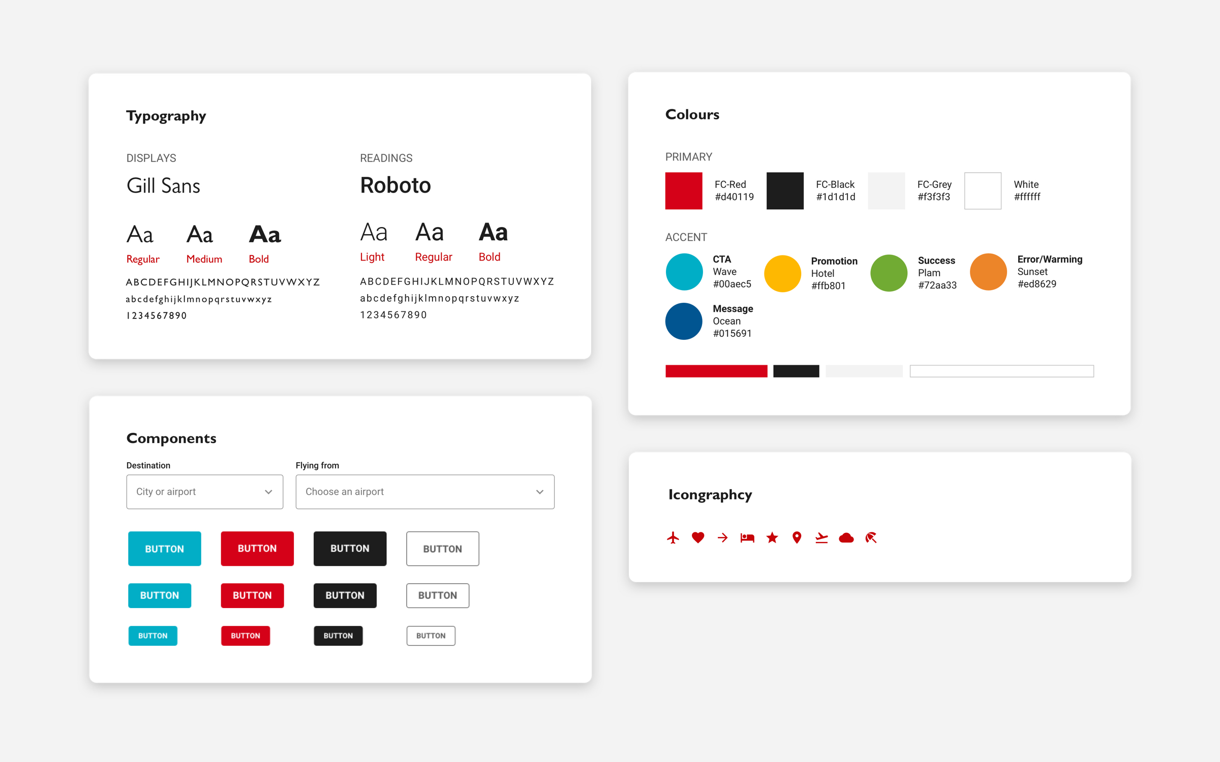
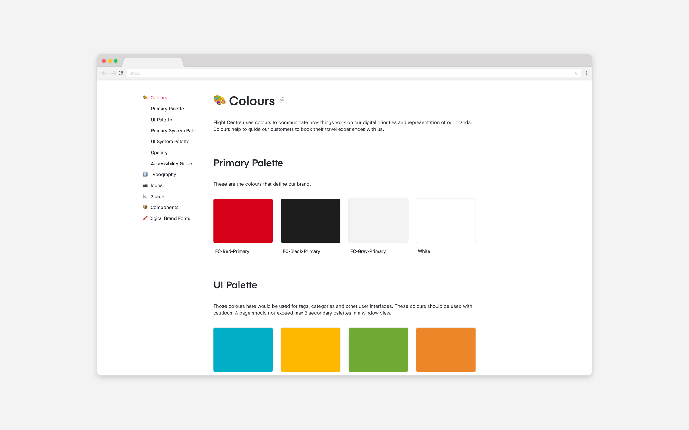
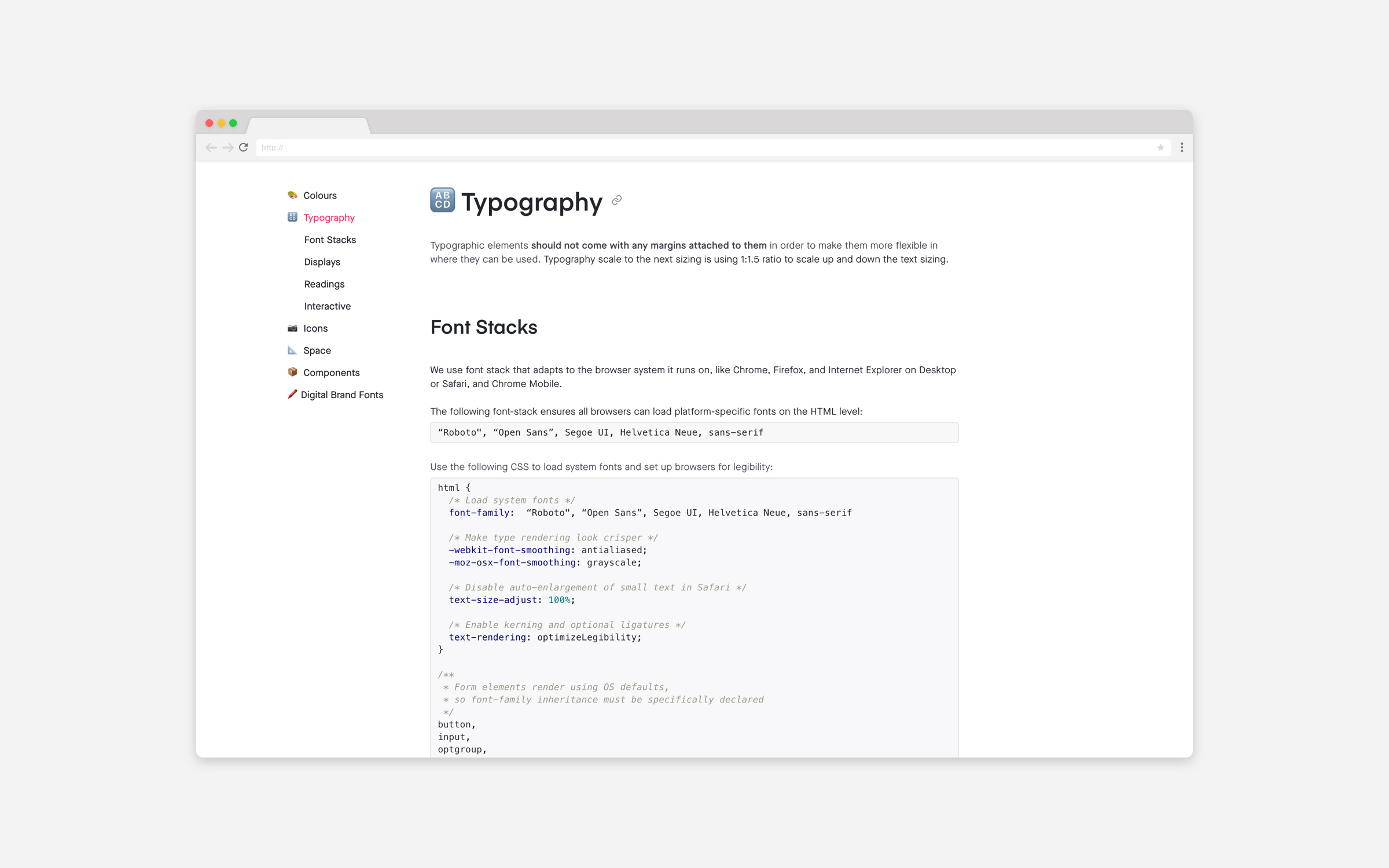
Flight Centre Stylstic Elements
Typography and Colour Symbols
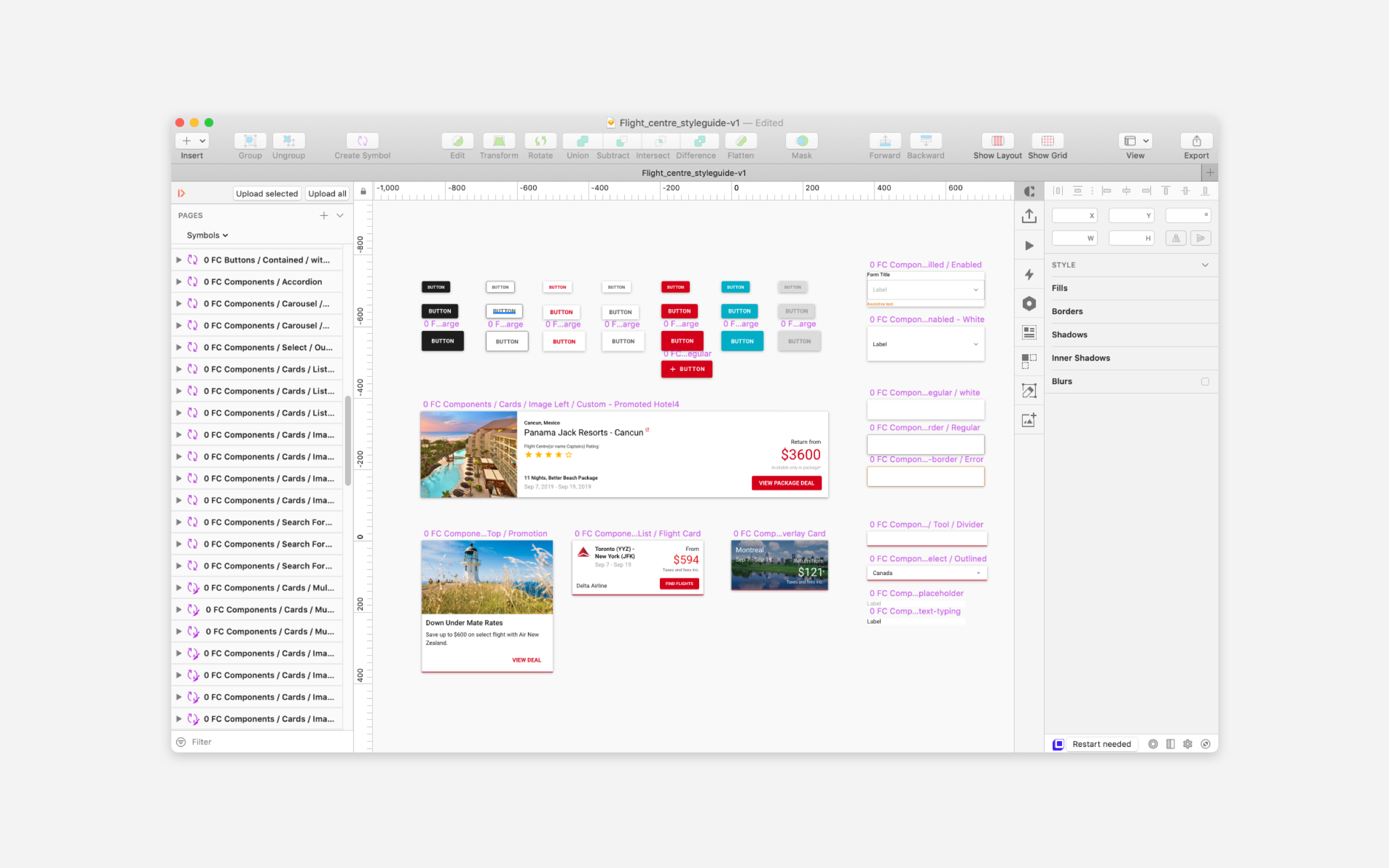
Resuable Componenet Symbols
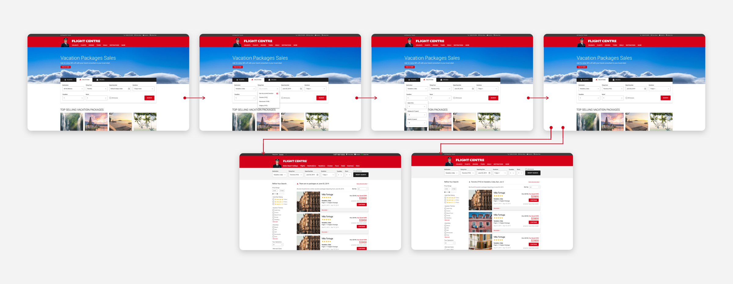
Example of "I must have that vacation package" flow made using the Flight Centre branded Sketch Library
Outcomes
The document was made referencing the development document library at Atlassian Confluence from the Digital team. A system is always an ongoing project and will grow and adapt over time.
The Styleguide was not able to grow into a system that I was hoping for when I was working with Flight Centre Canada. My goal was it also referencing the SMACSS/BEM CSS code base. However, It remains as a style guide for the Creative Team and people to reference when making digital designs.
See the Flight Centre Canada Digital Styleguide