Mobile Web Experience
Product, UX, Front-end Design
Redesigning Later’s Mobile Web for Enhancing Key Features and User Experience
Later, a social media management platform was mainly focused on desktop web and mobile apps, neglecting the mobile web. In 2022, there was a big increase in user traffic on mobile web, showing a opportunity to enhance user experiencewith onboardingand Linkin.bio activation.
I collaborated with teams to address tech debt, redesign mobile webfor improved user engagement, and align with company vision.
“Linkin.bio” is Later product feature for creating clickable mini website URL in your Instagram profile that shares info about your business and products, like your website link and contact details.
Collaborations
Growth Team: 1 UX, 1 Product Design, 1 PM, 3-4 Devs, 1 QA, 1 Research.
Linkedin.bio Team & Bigger Design Team Collaboration
My Role
User Experience Design, Strategy, Research, Front-End CSS Development, Mobile Web and Design Systems
Time
Mar 2022 - Oct 2023
Status
Completed & Implemented
Demo
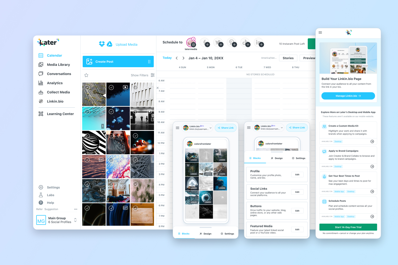
Final mobile web designs delivery overview.
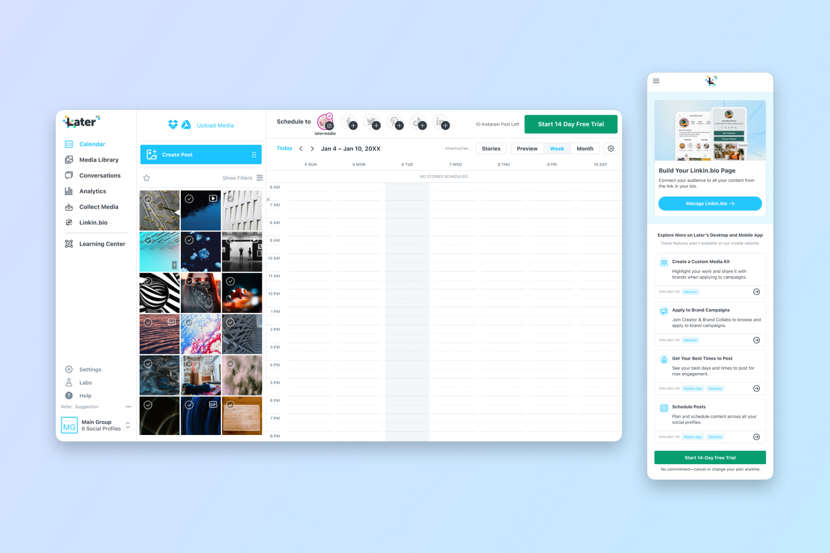
Showing the home page difference between the 2 devices.
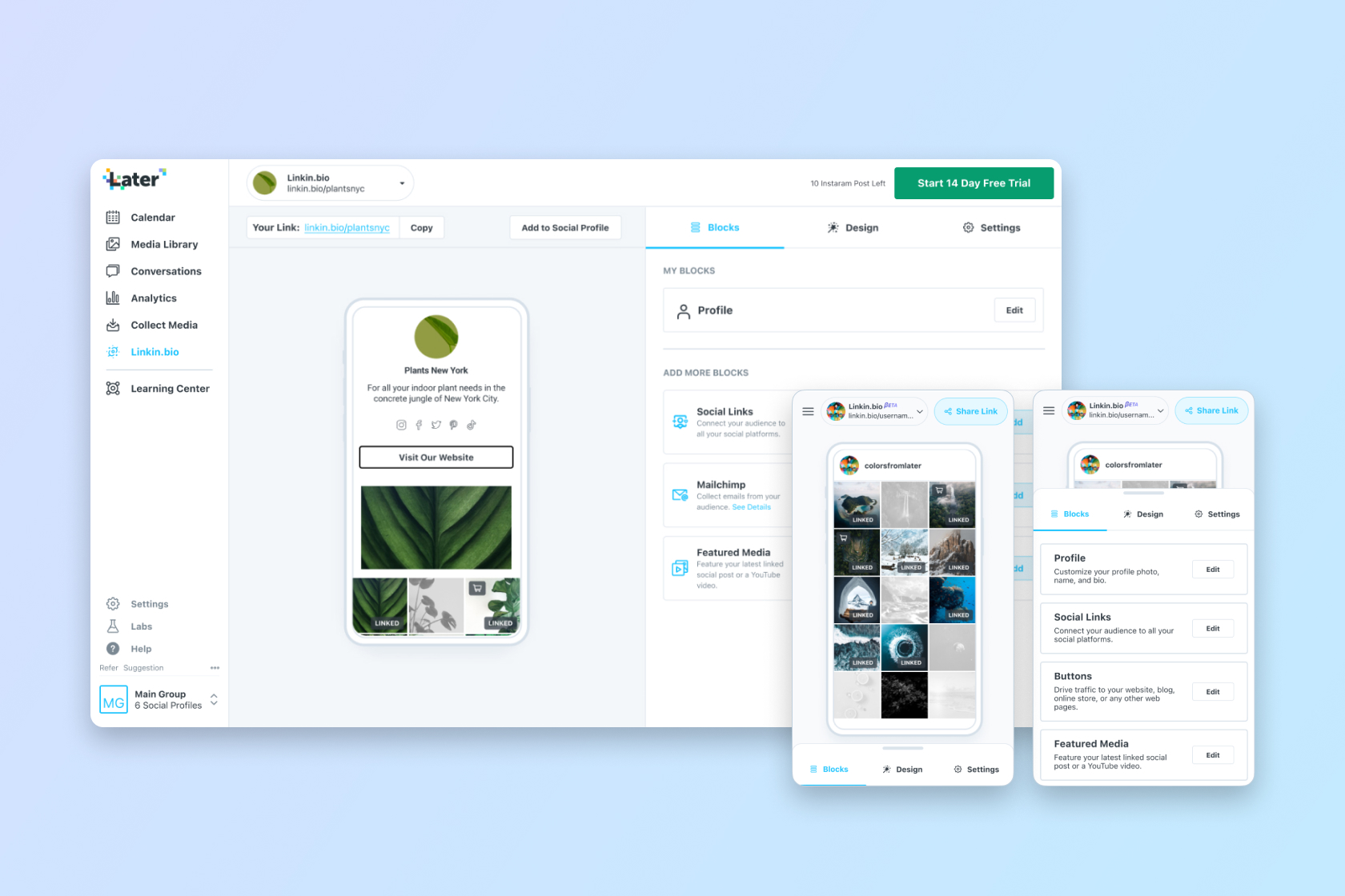
Showing Linkin.Bio difference.
Impacts
Results Overview
After rollout, the re-designed mobile web experience delivered measurable improvements in both user engagement and business outcomes. It also improved user sentiment toward the mobile web experience, particularly for those discovering Later for the first time via mobile traffic.
Mobile Sign-Up to Trial Conversion
+37%Within 3 months
Mobile Trial Conversion
+42%Within 3 months
Mobile Linkin.bio Activation
+600%Within 3 months
Mobile Trial Start from Linkin.bio
+200%Within 6 months
+37% Sign-Up to Trial Conversion within 3 months.
+42% Trial Conversion within 3 months.
+600% Linkin.bio Activation in 3 months.
+200% Trial Start Conversion from Linkin.bio opt-ins within 6 months.
Problem Statment
Challenges
Later’s mobile web experience was underdeveloped, leading to user frustrations, low trial conversion rates, and poor engagement with key features like Linkin.bio. The mobile web funnel failed to capitalize on the growing traffic and struggled to guide users through onboarding effectively.
From Growth Team: Sign-up Conversions
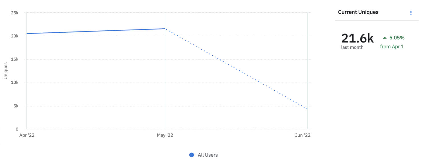
More users were visiting the mobile site, and about 30% (~21.6K) were signing up through the mobile web. Mobile site sign-ups were increasing, while desktop sign-ups stayed the same. Only around 1% of mobile sign-ups switch to desktop sign-ins.
From Linkin.bio: Lost of Mobile Opportunity
Most Linkin.bio users mainly used the mobile web, which accounted for around 70% of traffic. The platform was originally desktop-oriented, not mobile-first, making the mobile web unusable. In addition, the Linkin.bio feature was unavailable in the mobile app.
Key Issues Summarized:
- Neglected User Onboarding: Poor user flow and engagement during onboarding resulted in high drop-off rates.
- Low Trial Conversion: Users signing up on the mobile web faced barriers when transitioning into product trials.
- Linkin.bio Activation: Despite its potential, the Linkin.bio feature saw limited activations due to a lack of visibility and friction within the mobile experience.
Project Goals
Enhancing Mobile Web Experience and Linkedin.bio Activation
The goals of this project were to take a significant step in enhancing Later’s mobile web experience, starting with the onboarding flow, core user interactions, and Linkedin.bio activation, and fixing UX paper cuts along the way.
Business Goals: Test Linkedin.bio Desirability, Increase Sign-up Conversion Rate
To make the mobile web experience a high-value channel that supports key functions and ensures users stay engaged without frustration, we aimed to keep users moving forward with this touch point without facing a dead-end flow. The Linkedin.bio mobile web feature was gradually rolled out in phases to test its desirability before investing in more mobile web features.
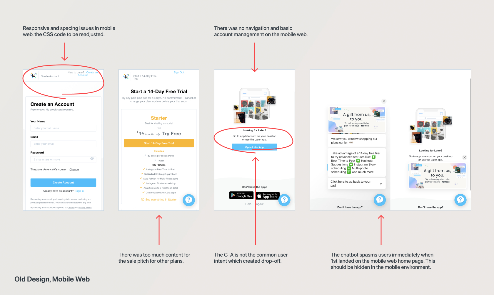
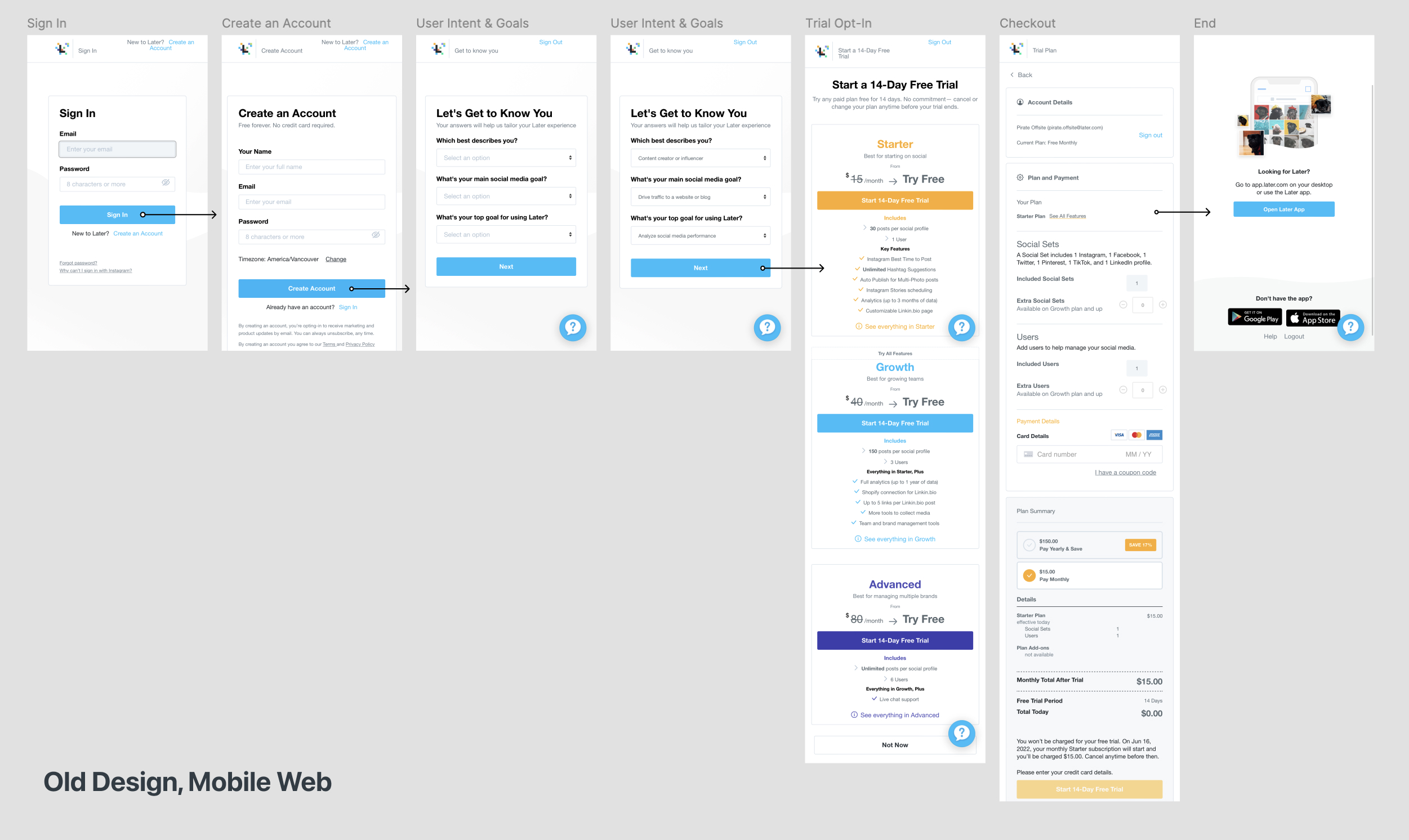
Heuristic analysis of the pre-existing mobile web onboarding.
Customer Goals: Reduce Time + Effort for Linkedin.bio Activation from Mobile Environment
Customer persona types like influencers, small business owners, and agencies, seek a simple way to activate their Linkedin.bio profiles on mobile.They want to save time and effort, enabling them to quickly establish their presence and showcase their brands without needing to use a desktop. By streamlining the activation steps in the mobile interface, users can navigate smoothly and focus on sharing content and connecting with their audience without hassle.
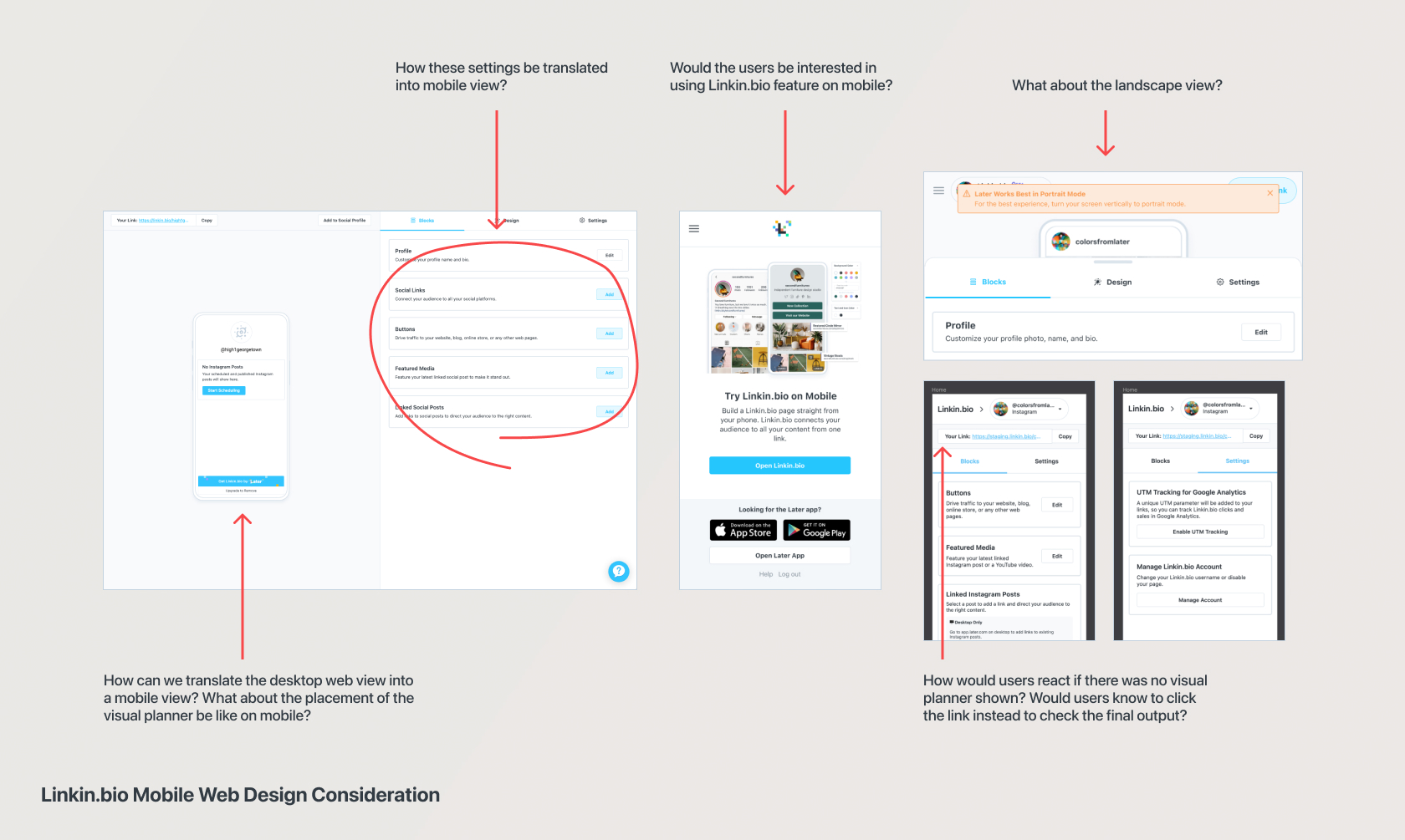
Heuristic analysis of the Linkin.bio feature for mobile view.
Competitive Analysis
Precedents Study
Documented existing platforms with similar features to guide design exploration, focusing on Instagram's layout as it was already familiar to the users and made up the majority of user traffic. This analysis provided key insights for enhancing user experience in the project.
Some Precedents Highlights
- Linktree: Direct competitor in the Linkin.bio space, offering a streamlined mobile web experience. Our challenge was to balance the complexity of Later's offering while simplifying user engagement on the mobile web.
- Hootsuite:Social media management competitor, although targeting a different market. Later’s niche positioning and distinct user base allowed us to prioritize different features for our mobile web strategy.
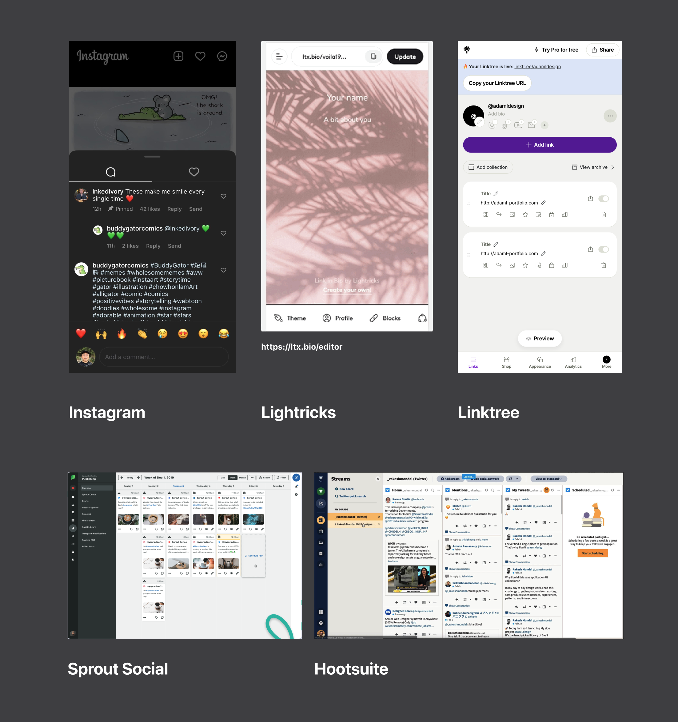
Showing Precedents + Competitions Exploration
Defining the MVP
A Complete Flow from Account Creation to Linkedin.bio Setup
To provide a seamless and engaging user journey, the MVP focused on guiding users from account creation directly to setting up their Linkedin.bio.
3 Main Project Parts
- 1st Linkedin.bio Access & Set Up: Fix the mobile interface onboarding UX Paper cuts and enable Instagram activation to Linkedin.bio with basic function.
- Mobile Navigation, Setting, Trial, and Advance Linkedin.bio features: Create responsive componentsfor the mobile interface ensure a smooth user experience, and enable Linkedin.bio advance feature with phone preview.
- Possible Mobile Web Features Expansion: The mobile web environment opens opportunities to measure user interest in features like "Best Time to Post" and "Media Campaigns." This expansion provides additional contextand redirects to other popular features in Later’s ecosystem.
Flow Charts
To make Linkedin.bio easier to use on mobile, the MVP focused on building the 1st pipeline of the journey from creating an account to activating Linkin.bio. And, rest of the mobile features will enabled in the 2nd phase. The flow chart below showcases all the entry points of the mobile web features enabled and used in stakeholder expectation meetings.
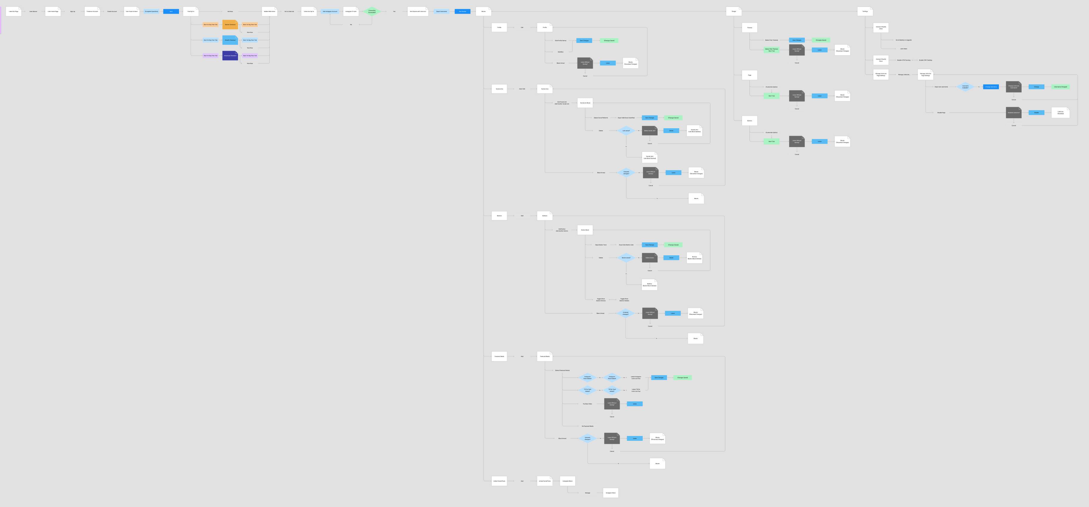
An iteration of the mobile web site map, showing the complete feature inventory for the scope.
Wireframes + Affinity Mapping
In a shaping session with designers, project managers, and tech leads, the team conducted an affinity mapping exercise to re-evaluate the design and feature. This collaborative effort involved organizing insights and ideas to create a clear, rough guide for the next steps in the design process, ensuring alignment across all stakeholders.
The plan included eliminating unnecessary chatbot messagesto enhance the onboarding experience. Changes would also be implemented on the checkout page to ensure compatibility across all devicesfor both trial and non-trial users. Finally, a phone preview page will allow users to see how their Linkin.bio pages appear, and the rest of the advanced features of responsive design for Linkin.bio.
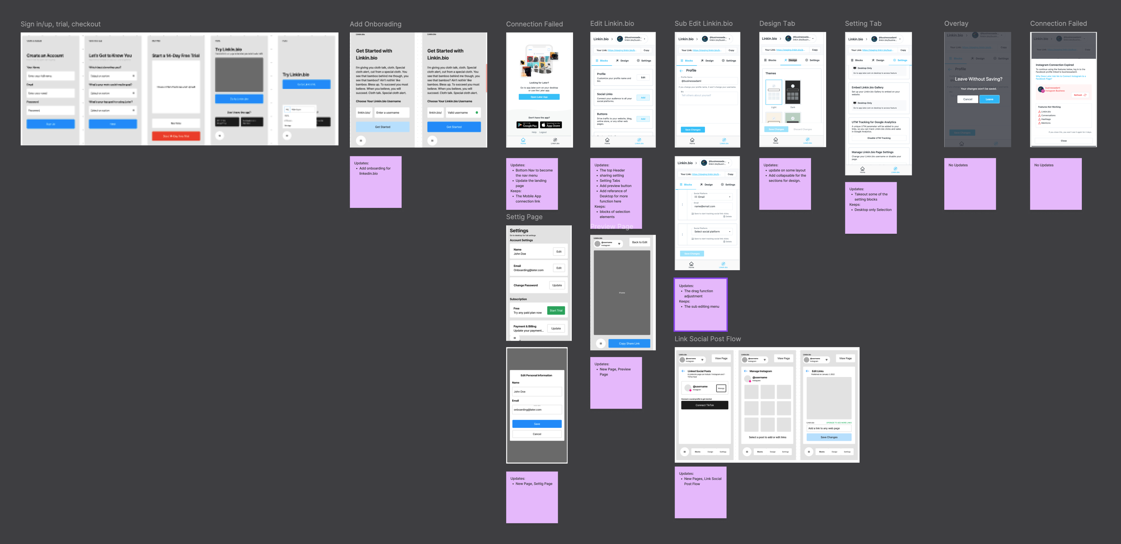
Showing Mobile Navigation, Setting, Trial, and Advance Linkedin.bio Journey Map + Affinity Mapping
Success Metrics Definition
The project's success was tracked by monitoring the number of mobile Linkedin.bio activations and overall mobile engagement, along with sign-up and trial conversion rates. These metrics provided a clear view of the feature’s impact on user retention and engagement.
Increase Sign-up-to-trial conversions.
Improve Linkin.bio activation.
Reduce User drop-off during onboarding.
Design Part 1, High-fidelity Research for Impact
Test Linkin.bio Desirability, Beta Launch
During the beta phase, we incrementally introduced the introduced the redesigned mobile web experience, gathering insights to justify part 2 of the Linkin.bio rollout. Testing confirmed LinkedIn.bio’s appeal and validated assumptions about users’ mobile engagement habits, informing our strategies for the next rollout.
I also worked with Linkin.bio team's designer' for the mobile version of the design and worked on the CSS architecture of the mobile web design with other Later's design leads and managers.
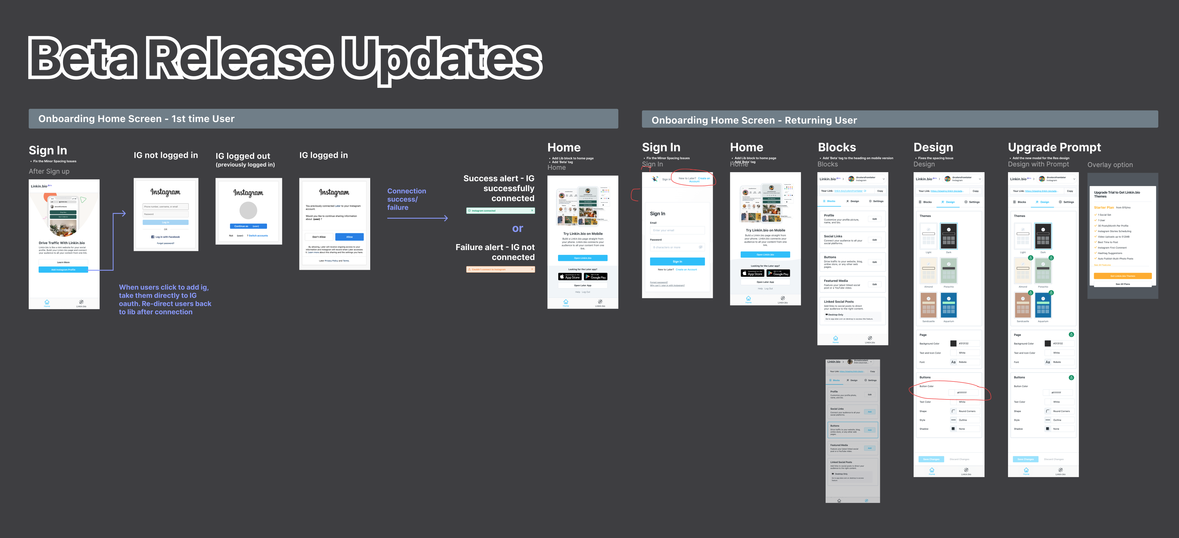
Part 1, the design mockup flow consisted of basic Linkin.bio activation.
Design Part 2, Revised Design
Onboarding, Home and Full Linkin.bio Roll Out
In part 2, the focus shifted to a complete rollout after the success of the beta launch from part 1 with significant access to mobile. This involved improving the onboarding process, redesigning the home interface, and adding basic settings functionality, as well as optimizing trial/checkout for better user experience.
This part also fully launched Linkedin.bio activation on mobile, allowing users to do more activities directly from mobile without needing a desktop, with more Linkedin.bio setting optimization for mobile, and preview mode. There was more mobile responsiveness from the CSS side for this phase for navigation and more complicated features to translate into mobile web versions.
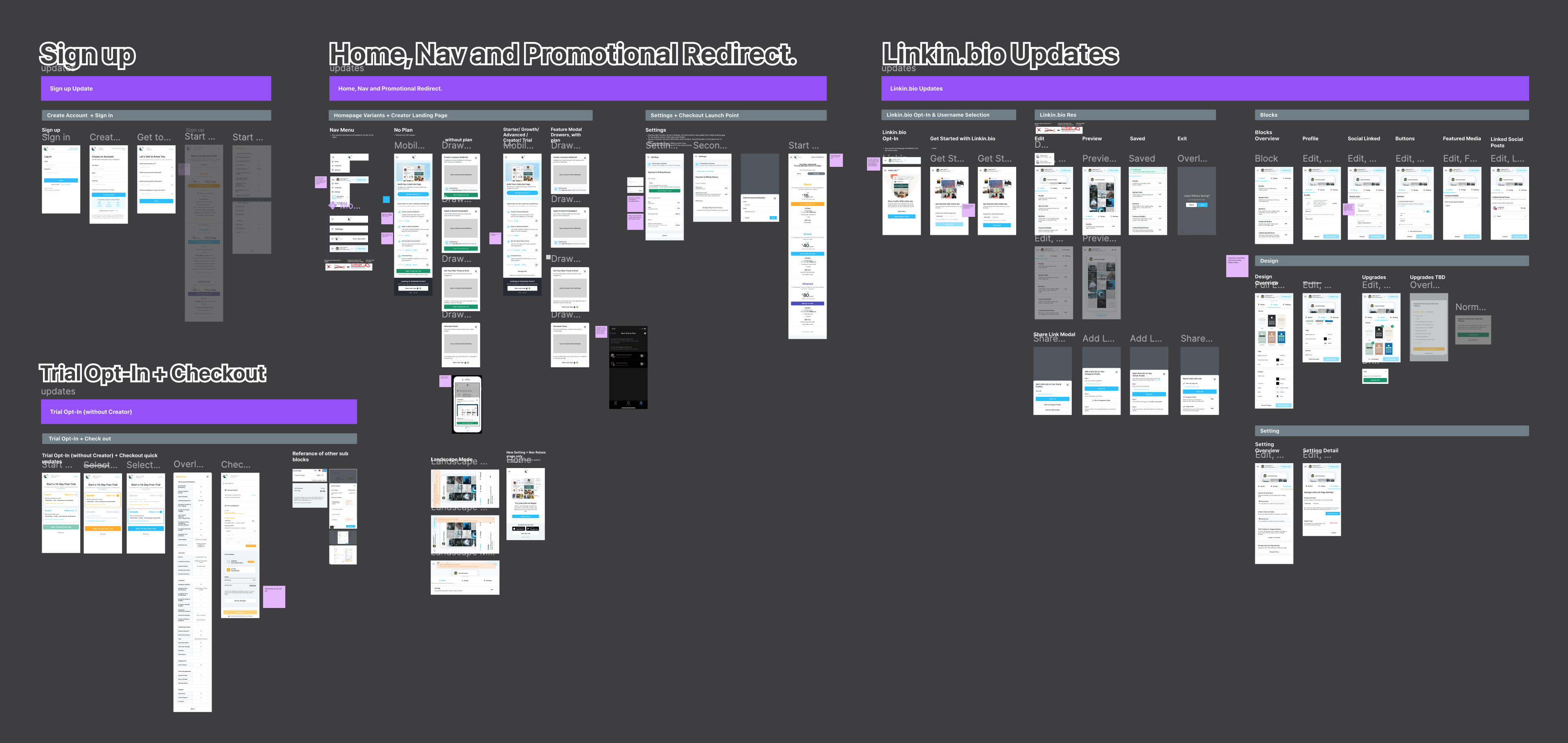
Part 2 + 3 the design mockup consisted of all the basic scope for the mobile web redesign
As part 3 was worked in sync with part 1 from the research team, the rollout introduced a promotional redirect to key features in Later's product ecosystem, including Media Kit, Brand Campaigns, Best Time to Post, and Scheduled Posts. The aim was to boost engagement and improve overall interaction for further expansion in mobile.
Design Part 3, Prototype and Test
Future Expansion: More Features on Mobile Web
Part 3 focuses on expanding mobile web features and research user feedback and engagement metrics. This part focuses on prototyping the interface with new features and research. The enhancements may include adding capabilities like Best Time to Post and Media Campaigns, offering users more context and utility. These features aim to further streamline the user experience, solidifying the mobile web as a vital channel.
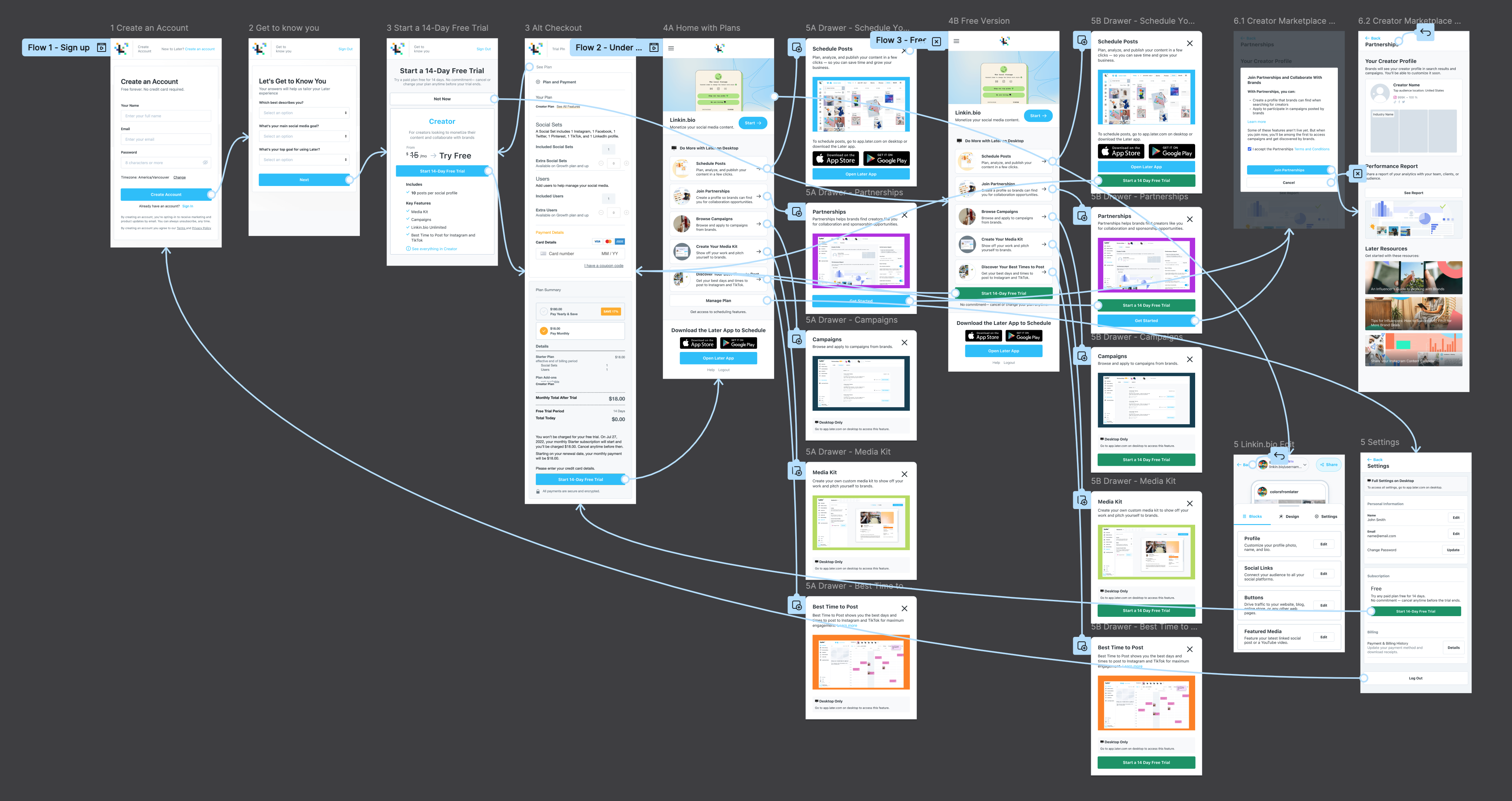
A rough prototype was made for the research team to gather insight for the future expansions
Design System
Mobile Web Design Guide
Finally, I created the "Mobile Web Design Rules" while working on the delivery for this project, contributing to the team's design system to ensure a cohesive user experience. These rules emphasize responsive design, visual hierarchy, and adequate whitespace for readability. Additionally, I established CSS coding guidelines that focus on modular styling, naming conventions, and performance optimization for the team.
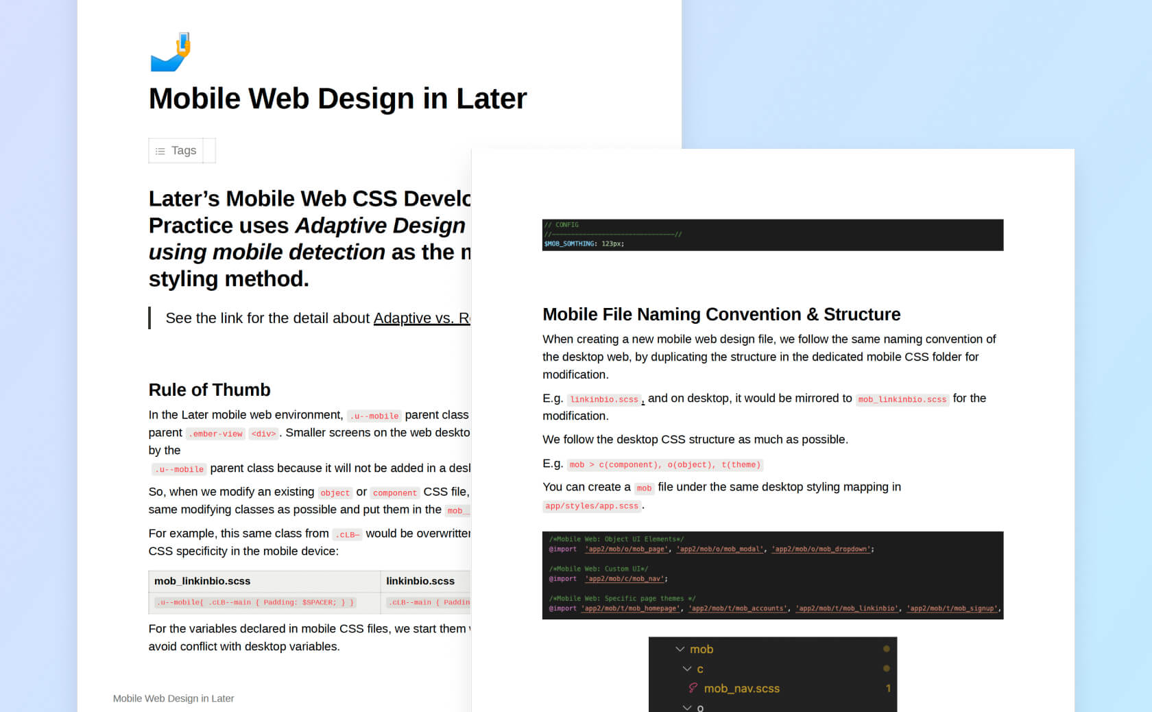
A written document for mobile web design and coding.
Key Takeaways
Collaboration is Key
Working closely with other designers, product managers, engineers, and the Linkedin.bio team, we were able to align on project goals and deliver a seamless, consistent experience across platforms.
Data-Driven Design
We relied heavily on user feedback and data analytics to inform our design decisions, ensuring that every change was backed by insights from real users.
Iterative Development
Breaking the redesign into phases allowed us to continuously improve the product while delivering value incrementally. This approach ensured that we could respond to user needs quickly and efficiently.

