Shangri-La Hotels and Resorts - Responsive Web + Hotel Booking Redesign
Web, Visual Design
Web Redesign Rational
Shangri-la Hotel and Resort is an International hotel chain known for its high-end services. With the rising of sharing hospitality like Airbnb, and in high competitions from other luxury hotel chains, like Four Seasons, or Mandarin Oriental. An up-to-date site with a great online experience is crucial in competition today.
Problem
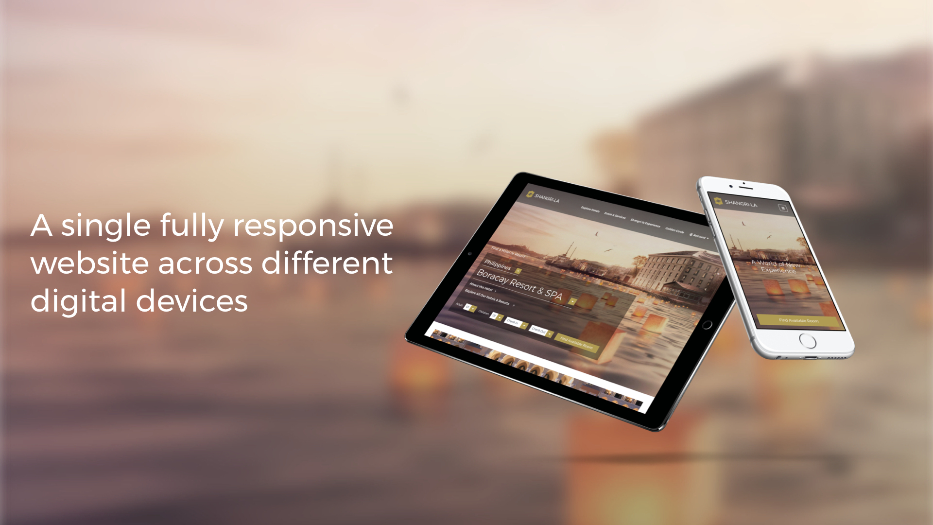
Their 2017 website is not responsive, although the adaptive mobile website is presented. A cohesive online experience is important for the customers to increase the familiarity of the hotel and service with a unified channel. The navigation of the site is not visually designed well, which cost the development problem for the site responsiveness. The room booking service could use some upgrade. Shangri-La needs a better digital design for their sites!

shangri-La’s 2017 Homepage Design

Proposed New Design
Conceptual Project
A personal side project on hospitality website design
Role
Art Direction, CX, UI & Web Design
Year
Summer, 2017
Acting Client
Shangri-La Hotels and Resorts
www.shangri-la.com


Goals: Showcasing the Best Digital Customer Service through Unified Web Experience.
Design Update 1: Improve the Digital Customer Service Experience of by Providing:
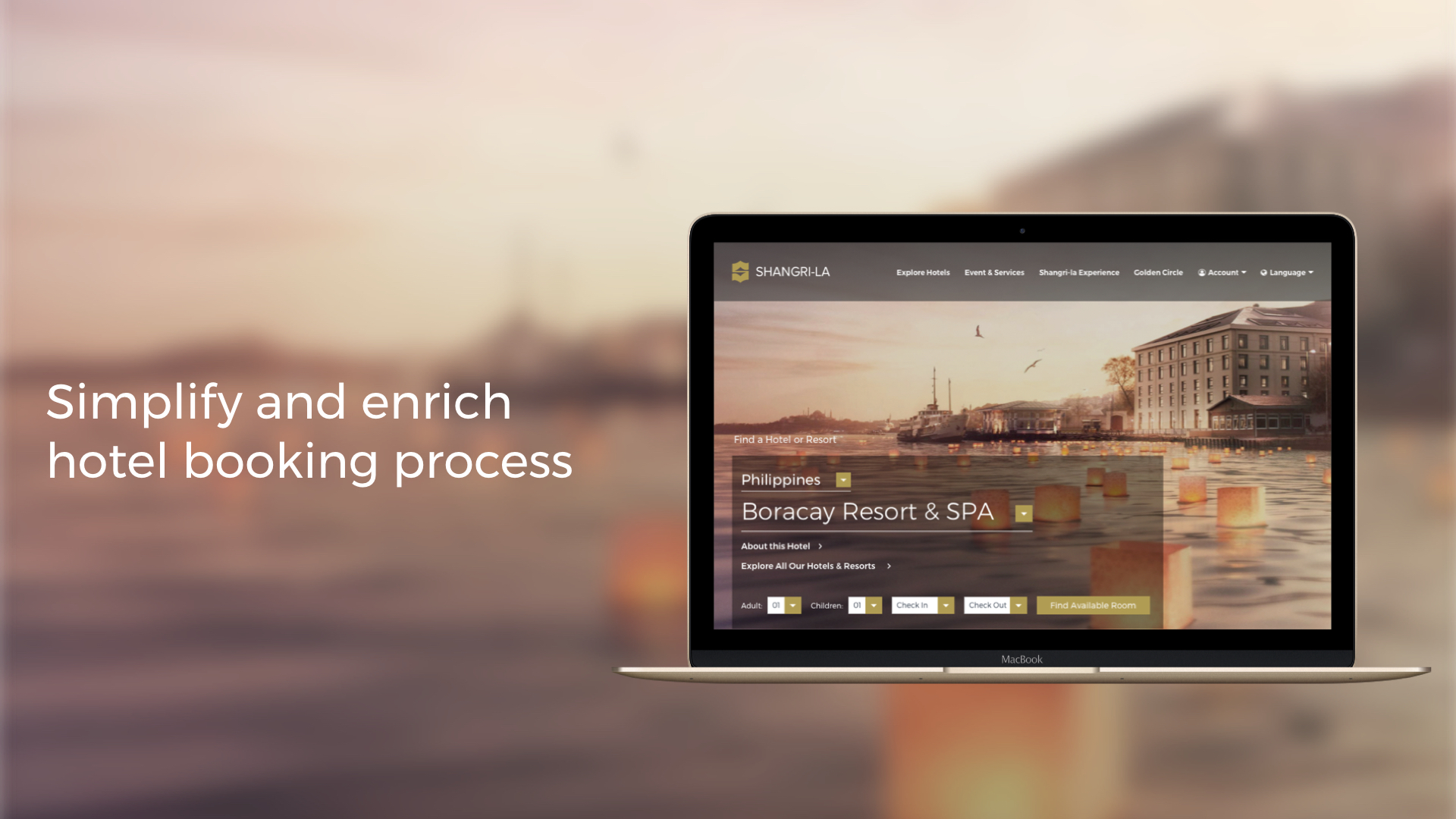
Design Update 2: Matching shangri-La Hotel's Physical Experience to its Digital Experience by Creating:
Competitive Analysis: How's Site Competing with Similar Hotel Brands, What is Shangri-la Standing?

Art Direction & Creative Exploration

Shangri-La Stylescape

UI Complements Exploration
The pre-existing web style were used as the starting point for the new stylescape for Shangri-La. The brand's colour which is black and gold are used as the main colour theme. Few extra colour palettes were added for the system colour usage.
The typefaces choices are Montserrat (for body text), Merriweather (for heading text), and Sorts Mill Goudy (for pull quote text). The goal here is to update the initial font choices by using Time New Roman, to give the site more of the modern look.
The stylescape also contains UI designs, inspired from other travel and hospitality site, such as lonely planet. The final designs also take into account other competitions’ websites (Four Seasons Hotels and Resorts, Mandarin Oriental Hotels, and Fairmont Hotels and Resorts) as the initial reference for re-design for explorations.
Sketches & Iterations
Phase 1 - Initial Layout Sketches
I started with the creation of the site on sketch, focusing on the site's elements rather than visual components, allowing quick feedbacks and adjustments.

Phase 2 - Defined User Journey
When dealing with a check out system of the site, I made a quick user journey analysis for checking what users would likely be expecting when booking a hotel room online.

Phase 3 - Redefined Sketches
As I go along with the project, I sketched out more pages as I noticed there are few more additional pages needed to complete the goal of the redesign. I used realistic content as much to the real production content to avoid arbitrary layout choices. I prefer content first, and design to support the content.

Wireframes
The wireframes were built for feedbacks amount the potential audiences and my designer friends. I also use this wireframe to layout down the fundamental work for the high fidelity mockups. I also made the wireframes into clickable prototypes in order to test out the flow on a desktop.
Clickable Wireframes - Desktop

Wireframe - Desktop

Wireframe - Mobile

Design System & High Fidelity UI Mockup Concept
Further developing upon on the initial stylescape style, my design elements were organized and translated into design system and UI components library. I was trying to use components concept from front-end methods (SMACSS or Atomic) to layout the ground work, translating between design and development. Those components further developed as high fidelity UI. Here are the final design concept of the project as followed:
Proposed Shangri-La Design System

UI Complements within the Proposed Shangri-La Design System

1) showing the main navigation desktop and mobile. 2) booking steps. 3) Booking Navigation. 4) Footer. 5) Booking Card. 6) Basic Dropdown. 7) Link card. 8) Button. 9) CTA Button. 10) logo colour set.
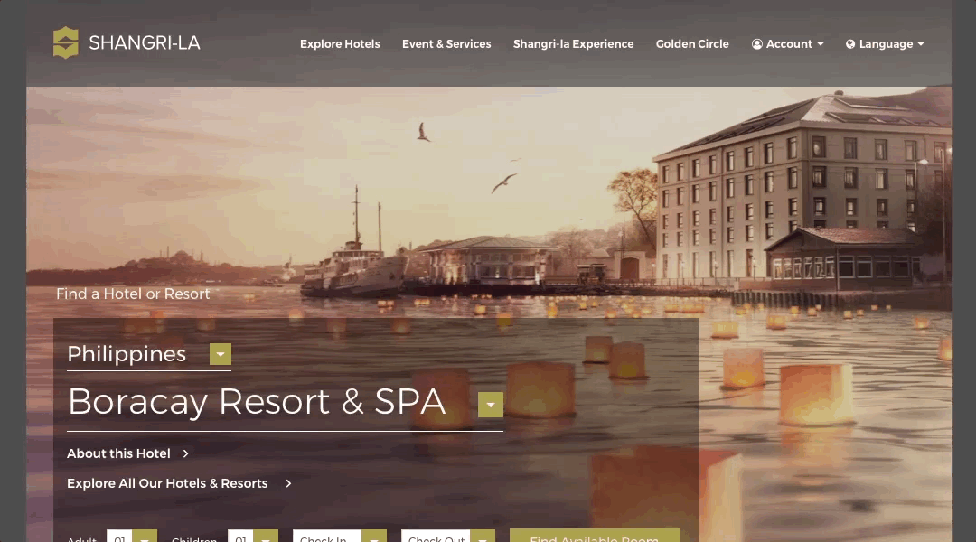
Proposed Shangri-La High Fidelity Mockup - Desktop UI

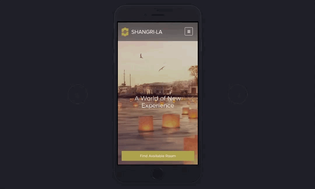
Proposed Shangri-La High Fidelity Mockup - Mobile UI

Shangri-La Mockup Prototype - Desktop
Shangri-La Mockup Prototype - Mobile
About Shangri-La Hotels and Resorts
The Shangri-La story began in 1971 with its first deluxe hotel in Singapore. Today, Hong Kong-based Shangri-La Hotels and Resorts, one of the world’s most respected hotel companies, owns and/or manages over 102 hotels and resorts under the Shangri-La] in Asia, Europe, the Middle East, North America and Australia.
View More